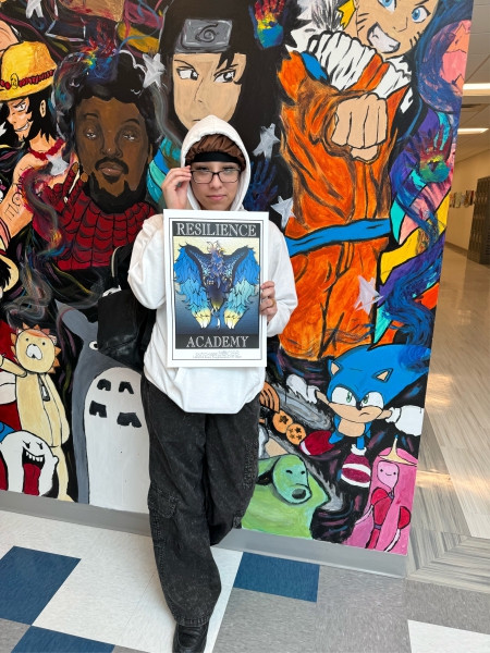
 The Resilience Academy at Dutchess BOCES is ready to reveal its new mascot, part of the larger rebranding that began this school year. The new mascot is a phoenix, which Principal Kiesha Tillman says represents a fresh start and rising again.
Students were invited to create designs to be considered for the mascot. Seven students submitted their work, and at the quarter three assembly, students and staff voted, and Abigail Gonzalez’s phoenix was chosen.
Honestly, I never thought I’d make it this far with my art,” shared Gonzalez. “It’s pretty exciting.”
Tillman shared, “I think the mascot is very important in an alternative school like this because we are not a traditional school where there are certain activities that bind students together.” With students from all over the county and beyond, Tillman says her goal is to bridge the gap and build a school community with a positive and rich climate and culture. Creating a symbol that unifies the school with input from the students and staff is one step toward this goal.
Gonzalez shared that she doesn’t typically draw animals, or anything mythical. Speaking on trying something new, Gonzalez shared, “It took a lot of time, about a month and a half to finish the sketch alone and to plan out what it would look like.” After completing the sketch, she created a variety of digital drawings on Procreate.
Gonzalez reflected on what she learned through the process. “I learned how to draw wings because that was new to me,” using online reference material to teach herself. “I also learned a lot of patience.”
After her artwork was selected, Gonzalez worked with BOCES’ graphic designer Desiree Gagnon to prepare the mascot for use in the school. “I think her design is fabulous and I love all the hard work she put into it,” shared Gagnon. 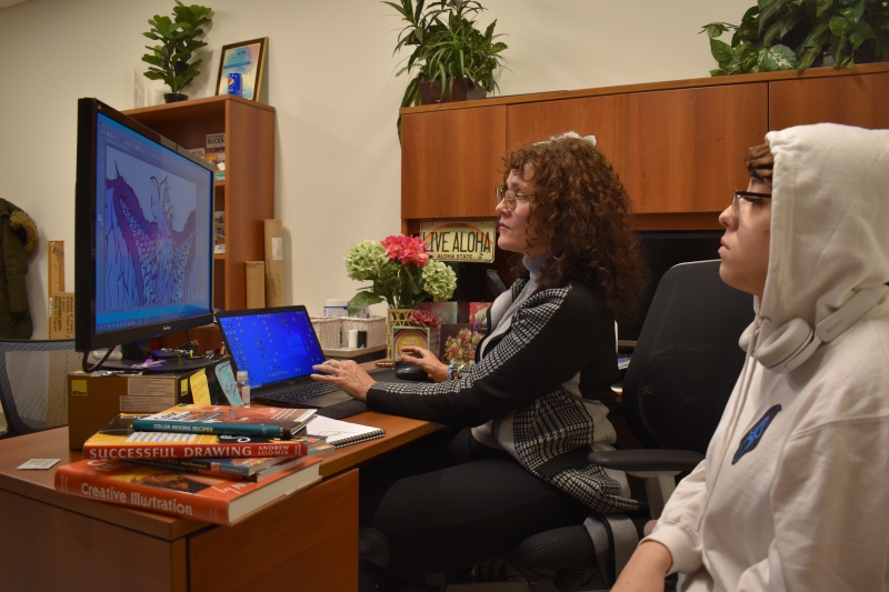
The artists discussed what message the mascot will send through its design and positioning.
When Gagnon asked Gonzalez why she chose to have the wings of the phoenix facing down, Gonzalez shared it was to give the phoenix a school mascot look, “so instead of the wings being up, it is relaxed, but it still looks bold.” Gagnon added that when working together on finalizing the image, the bird extends past the rectangle that it’s in, sharing “We have the wings going past the line because we wanted it to represent breaking the boundaries.” The two feel that the final version is welcoming and embracing, like the Resilience Academy itself.
In addition to working on variations for products with the new school logo, Gagnon and Gonzalez enjoyed talking about art in general. Gagnon, a self-taught designer, shared resources that helped her get to where she is today. “I saw some things today that I've never seen,” shared Gonzalez, “It was really helpful.”
Gonzalez is considering graphic design and photography as possible careers after her time at the Resilience Academy comes to a close.
“I’m glad to leave a mark here when I graduate,” said Gonzalez.
“It was amazing to see Abigail working with the communications department and come and present the logo. It brought tears to my eyes because it represents the hard work that the staff and students have been doing here from September on,” shared Tillman. “The logo represents visually that we are a new school and that there are more great things to come.”